
The psychology of color and how to use it to bring more joy.
“People are afraid of color,” Stamberg told me. He was clearly referring to people other than himself and Aferiat, who live in a temple to vibrancy. Their open New York City loft was divided not with walls but with colors — panels of yellow, green, blue and orange. The two sat perched on a violet sofa, next to a pair of vermillion chairs, a pink rug underfoot.
“It’s the fear of making a choice,” Aferiat said. “Of making a mistake and having to live with it.” (Source: Scared of too much color in your life? Learn to let go of your fear — and find more joy)
In her article, Ingrid Fetell Lee calls people who are afraid of color “chromophobes” and talks about a cultural bias against color. She says vibrant colors are often perceived as child-like and neutrals and muted tones seem to be a sign of good taste and sophistication. It’s almost as if we started being ashamed of color and were looking for ways to make things more muted and neutral to fit in.
Choosing brand colors and deciding to commit to a specific palette is no easy task. However, people are connecting to brands with emotions and color is a very powerful way to trigger them. It’s said that 80% of the brands are recognized by their color alone and since color can strengthen or weaken your message, it should be applied strategically.
““Research reveals people make a subconscious judgment about a person, environment, or product within 90 seconds of initial viewing and that between 62% and 90% of that assessment is based on color alone.””
I bet you can easily think of the brand colors of the companies below. Of course, it’s partly because you see them over and over again but they show how important it is to be decisive about your brand color.

Choosing a palette for your brand
Whether you’ve decided to start your own business, or are launching a game-changing startup, understanding the impact of color on consumer behavior will greatly help your brand succeed. Here are some criteria you should look at when making color decisions.
How do I know which colors will work for my brand?
The right colors are appropriate for your brand
The right colors show off your brand’s personality
The right colors align with your values
The right colors appeal to your audience
The right colors differentiate your brand
Here’s a quick demonstration of how the same illustration can convey different feelings and values depending on the color palette used.

A strong monochromatic palette with different shades and values of green will work well for eco-friendly and sustainable businesses.
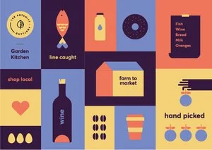
A colorful, vibrant, and high contrast palette will appeal to a younger crowd. This palette has a lot of energy.

A subdued, mostly pastel palette conveys a sense of calm and quiet while still providing contrast and visual interest.
(worksheets from Sarah Parkinson-Howe's Skillshare class Color Theory: Get Inspired by Color!)
““Colors are forces. Radiant energies that affect us positively or negatively, whether we’re aware of it or not.””
The meaning of color
What colors you choose for your brand has a tremendous impact on whether your communication is effective or not. Color theory is as much about the feeling a particular shade evokes than anything else. But here’s a quick reference guide for the common meanings of the most common colors:

Red: Love, Passion, Anger, Excitement
Orange: Energy, Success, Happiness, Vitality
Yellow: Happiness, Cheer, Hope, Creativity
Green: New Beginnings, Abundance, Healing, Nature
Blue: Calm, Trust, Responsibility, Competence
Purple: Spirituality, Royalty, Wealth, Ambition
Black: Mystery, Security, Elegance, Sophistication
Gray: Moody, Conservative, Formality, Stillness
White: Purity, Innocence, Cleanliness, Virtue
Brown: Nature, Wholesomeness, Dependability, Simplicity
Tan or Beige: Conservative, Security, Piety, Warmth
Cream or Ivory: Calm, Elegance, Purity, Quiet
The colors of joy
Color affects our emotions and can be used to infuse more of the ones you want in your life. I’m sure you’ve heard of color therapy - an alternative therapy that uses colors and their frequencies to heal physical and emotional problems. Also known as chromopathy, chromotherapy, or color healing, it can make a significant change in one’s life and their mood. I want to share a truly inspiring TED talk by Ingrid Fetell Lee who spent 10 years of her life chasing what it is that brings people joy and how we can bring more of it into our lives.
““There’s a part of us that finds joy in the same things. They remind us of the shared humanity that we have.””
